As I have been liking seeing interior design photos on magazines since I was young, I have followed some interior design platforms on social medias like Instagram, Tumblr and Pinterest as most of the designers nowadays prefer to share their works online. Here are some of the photos that have caught my attention.

German Pavilion by Mies Van Der Rohe is one of my favourite architecture. I like the idea of the statement, "less is more" is being applied to the interior design. The marble wall creates such a statement to the interior which makes the space look more sophisticated and luxurious. I personally like how the photo was taken by using the one-point perspective view.

I like the idea of taking up-close photo of the details in interior design. Even though it does not really show the theme and characteristics of the space in a bigger picture, but by looking at the photo, you can tell what kind of design the designer is going for. As for this particular image, industrial design style has been applied to the space by using container wall and vintage lamp shade.

The wall at the back brings texture not just in the interior but also to the photo. I like how the natural light diffuse in which creates more character to the space. The usage of colours in the interior gives a very high and crisp contrast which makes the photo look more eye-catching.
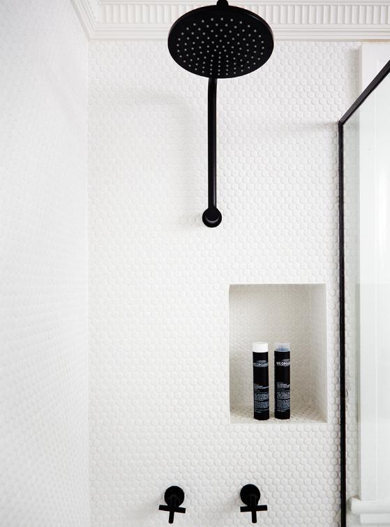
Even though the picture above is very minimal but I adore the high contrast of the monochrome colours. The white textured wall compliments the shower head and faucets which makes the black colour more outstanding.

The contrast between two different styles is also a favourite photography theme of mine. In this picture, I like the idea putting the luxurious dainty looking plate set on top of simple wooden table as it gives more statement to the platings.
No comments:
Post a Comment